
How A Gorgeous Rejected Design Tells the Story of Brand Strategy
A rebrand is no small undertaking and fraught with much harder decisions than it appears on the outside. As a case study, we take a look at the simple decision of a logo, for our client Rowe Wealth, soon to be Avalon.
Avalon is a high-powered investing and financial planning firm out of South Florida, with an impressive Wall Street pedigree and a focus on inviting a select clientele to grow as a result of their data-driven investment strategies.
After they approached us a few months back about rebranding, we spent weeks conversing with them, narrowing down their values, audience, brand history, strategy, and many other facets that we use to create the design for a rebrand. Then there were weeks more of creative ideation, internal discussion and brainstorming, trial and error, and finally, the design pitch itself.
Why all this consternation and time when fiverr is right there for the taking? Because a logo is your first sign of truth, the timeless symbol that everything to follow can and should be trusted.
We pitched three rebranding ideas. Here below is one of them:
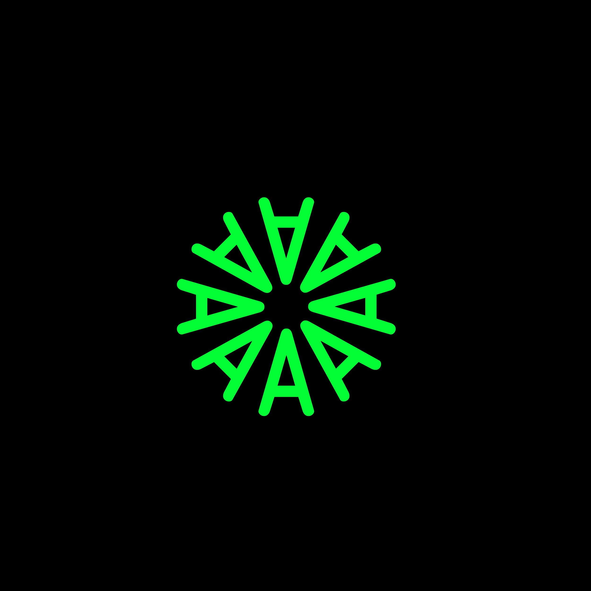
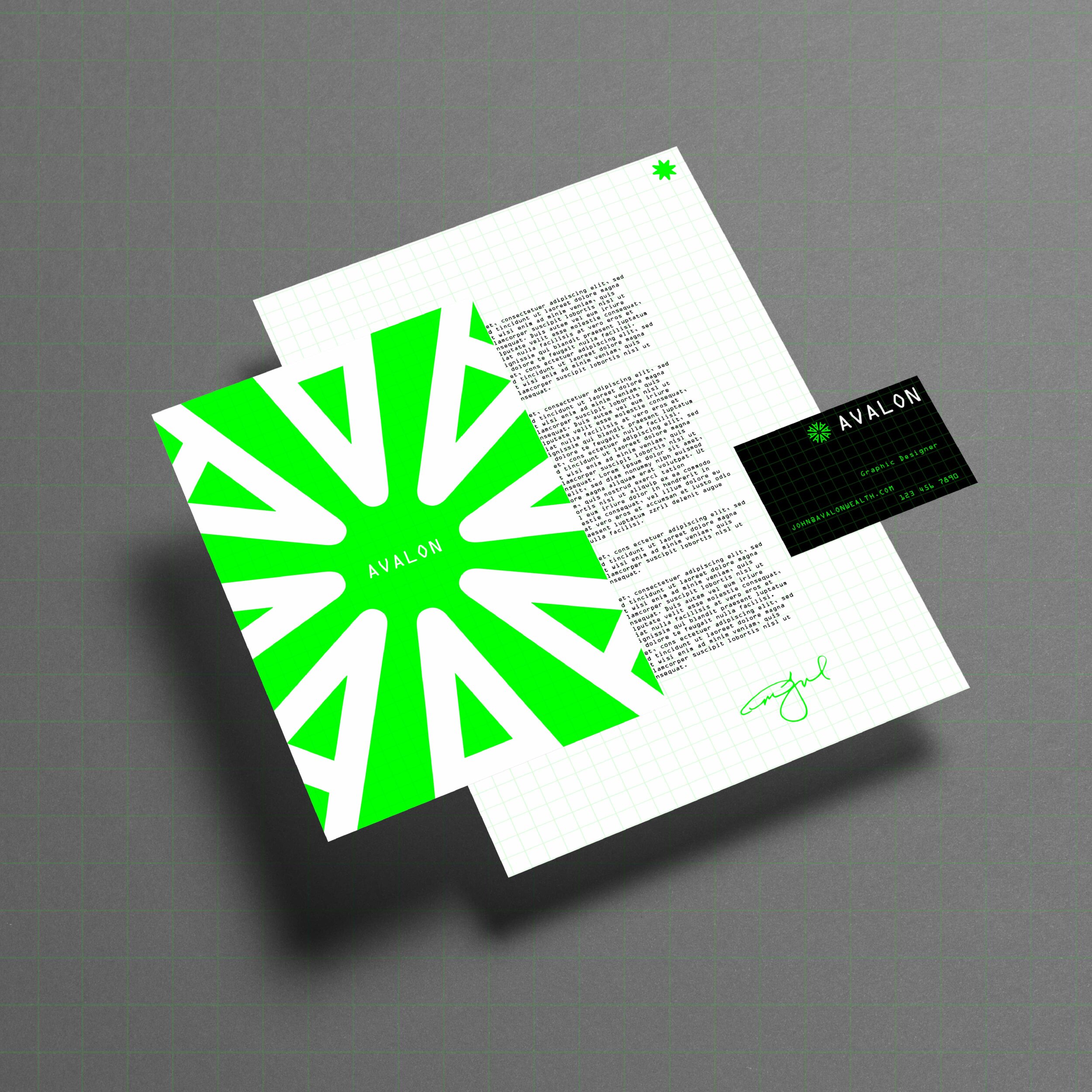

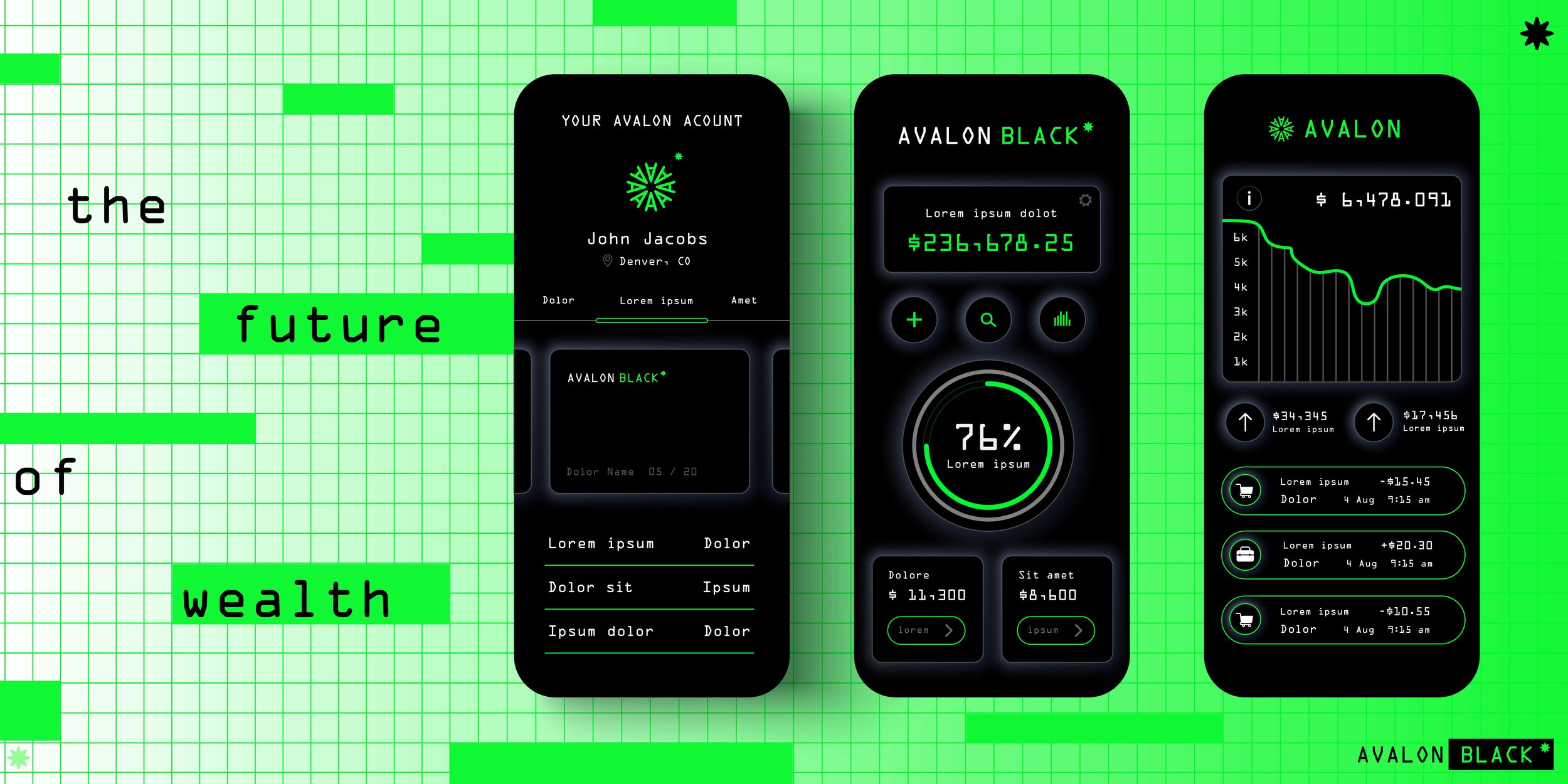
A collection of images from Moriah Manford’s designs for Avalon Wealth – click through to see them all.
All three of the pitched designs focused on different facets of Avalon’s brand presence and competitive positioning. But this one, in particular, created by our designer Moriah Manford, leaned into the tech-forward posture of Avalon’s brand.
We chose the name Avalon from the King Arthur saga – Avalon, of course being the famed land of promised wealth and peace that shepherds King Arthur back to health and provides an idyllic backdrop for much of his continued story.
For us at CultureCraft, Avalon was what Rowe would become for investors and clients – a place for them to find some peace of mind from the battle scars of hiring the wrong investment advisors. Avalon is an idyllic elite class where you could learn an expertly crafted investment strategy to move forward.
In essence, Avalon is where the future is forged.
Mo created a typographic logo, which is incredibly rare, in the shape of a circle – a round table if you will – and chose a green hue that hearkens to the vegetation and topography of South Florida and the tech power of The Matrix, a hidden truth hiding in plain sight. She spent long hours researching investment language, relative-strength strategies, geography, mythology, portfolio technology, and much more.
From the type, to the mark, to the color story, all the facets pointed to the technology forward piece of Avalon’s forthcoming brand. Mo’s research-backed design subtly reinforced the narrative of a mythological paradise made tangible because of Avalon’s investing and financial management acumen.
Now the spoiler: Avalon DID NOT choose this design.
We’re extremely excited to show you the design they DID choose in the coming weeks, which was also created by Moriah, and which we’re immensely proud of.
What happened in that design review process is the reason logos matter. The brand promise that we’d developed was an intersection of technology, elite status, accessible insights hidden in plain view, and a community of people tired of being duped by a well-heeled industry. Each design biased toward one or more of those elements of promise.
What logo the client chose says nothing about which one was “right.” What they chose shows us what they believe about who they are.
Design, because it heeds to the unspoken corners of our neurology, always tells the truth. As we dug deeper, it became clear that technology would provide the backbone for the customer experience at Avalon, but was not the heart of it’s promise.
That heart had to be illustrated a different way. (Stay tuned to our socials for the final chosen design.)
The design that Avalon eventually went with closely aligns with the brand promise they espouse and sets them competitively apart from the rest of the pack. Avalon’s invitation was extended to a select clientele to become part of an elite membership in a regal and timeless brand that provides safe harbor and a bold, literate investing and financial future.
Our commitment to truth, and the betterment of our clients, empowers us to go beyond making cool designs (all of them were cool) and pushes us toward the visual expression that most accurately invites the right audience to the right experience to produce lasting satisfaction.
Does a logo have the power to do all that? Not by itself, but it is the first invite into that journey. And as they say, you never get a second chance a first impression.
Now, what about you?
When was the last time you engaged a partner or agency who cared more about you than they did about themselves? And what kind of change\growth\life\creativity\meaning\and inspiration might you ripple forth into the world if you had someone who believed in you and fought for you that way?
Curious to find out? Then we’d love to hear from you.