
How And When To Pull The Trigger On A Brand and Logo Redesign
Somewhere near the beginning of our working relationship, our clients usually ask an interesting question:
What’s wrong with my current logo?
And the answer is often LOTS OF THINGS! (We usually find a gentle way of saying that). Whether it’s a new logo or a whole new brand redesign, here below are some reasons that an old logo or brand could use some sprucing up.
It’s Outdated
-
The original logo is outdated and tired with missed connections for the target audience.
Here’s one example: we all know that MCM (mid-century modern) is in right now and vintage is cool. But probably not when it comes to something that’s representing you. Unless you happen to build houses or sunglasses. In which case, it’s totally you.
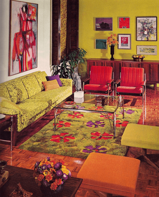
Design like this is appropriate if your product is mid-century modern inspired. But barring that, this is an outdated look and feel that most customers will find jarring, uninviting, and un-innovative.
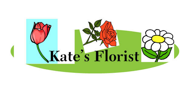
Forgettable Logos
-
Your logo is forgettable and looks like everything else that’s in the same industry.
Case in point: restaurants whose primary focus is to sell tacos don’t always need a taco in the logo. This deference to rely on old imagery is called “the safe space”.
We’re more interested in figuring how you can stick out, gain new clients, and build awareness. All things that are tough when you’re still just blending in.
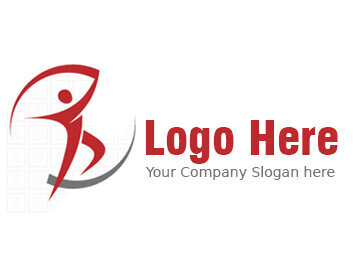
There is nothing differentiated in the design of this logo – it’s not specific to any one industry or trade. Moreover, because it’s a stock logo, you’re bound to see it around.
Poor Color Choice
-
Most client’s old logo colors are usually randomly chosen and don’t have a distinct color theory behind the choices made.
For instance: rainbows are not your friend. Unless it’s intentionally used to promote the LGBTQ+ community.
Designing your logo and brand around the right colors is one of the best ways to stand out from your competitors, and help the world understand that you know yourself and your product.
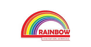
The use of rainbows in non-LGBTQ+ related businesses is a great example of mis-understanding one’s own business, as well as proof that one isn’t paying enough attention to the cultural significance of a logo or color scheme.
Time For a Change
-
If your business is taking a new direction or has expanded, it’s most likely time for a new logo.
Like with anything else, times change, and some things change quicker than others. So, you need to be prepared to adapt and this includes a fresh facelift in order to represent you and your consumers. It also helps signal to others that something has grown or gotten better. Always a plus.
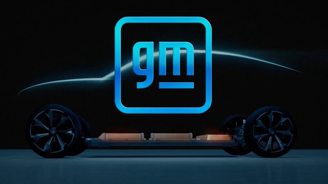
GM’s new logo moved the company away from the blocky design and outdated typeface of its muscle-car era days, and helped to modernize the look of the company as GM made the transition to manufacturing electric vehicles for a modern clientele.
Not Done By Experts
-
Your logo (and brand) has been DIY’d.
Your cousin Richie (who took graphic design for half a semester at junior college) is really trying to break into the design game and you decided to be a good relative and give him some work. But now your Car Wash business has a dolphin for a logo and your website is sunken-treasure-themed.
Why hire Richie, or do it yourself, when you can hire experts in their fields (designers that have studied for years) to help make clear distinctions in your brand and clarify your brand’s message?
Logos like these scream CLIPART and impart a sense of being cheap, thrown together, and poorly thought out.
Mis-matched Type Faces
-
Incorrect type pairings or worse, multiple typefaces that are misused, inconsistent, and have no clear hierarchy.
“The goal in rebranding is to strengthen your brand’s message and allow it to evolve. Although rebranding can do many things, it should support your core message while connecting with your audience in a new, authentic way.” – Greg Liberman, Chairman & CEO of Spark Networks.
In other words, a rebrand is an opportunity. An opportunity for your brand to attract new customers, differentiate itself in a saturated market, and create an experience that is geared directly at buyers looking for your product.
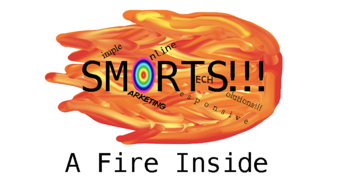
A uniform typeface again communicates careful planning and execution, letting your client know that you have a strong grasp on your product and company’s goals. Logos with differentiated typeface often look cheap or DIY’d, which as we mentioned above, doesn’t bode well for setting yourself up as an expert or professional.
The Time Is Now
It takes courage to be bold and we know that. But in such a saturated business world, you should be asking: is it time to stand out?
Allowing your company’s history to influence what your future will look like can help create a new brand awareness in an industry that is constantly doing the same things. And ultimately, that’s what the best rebrands do.
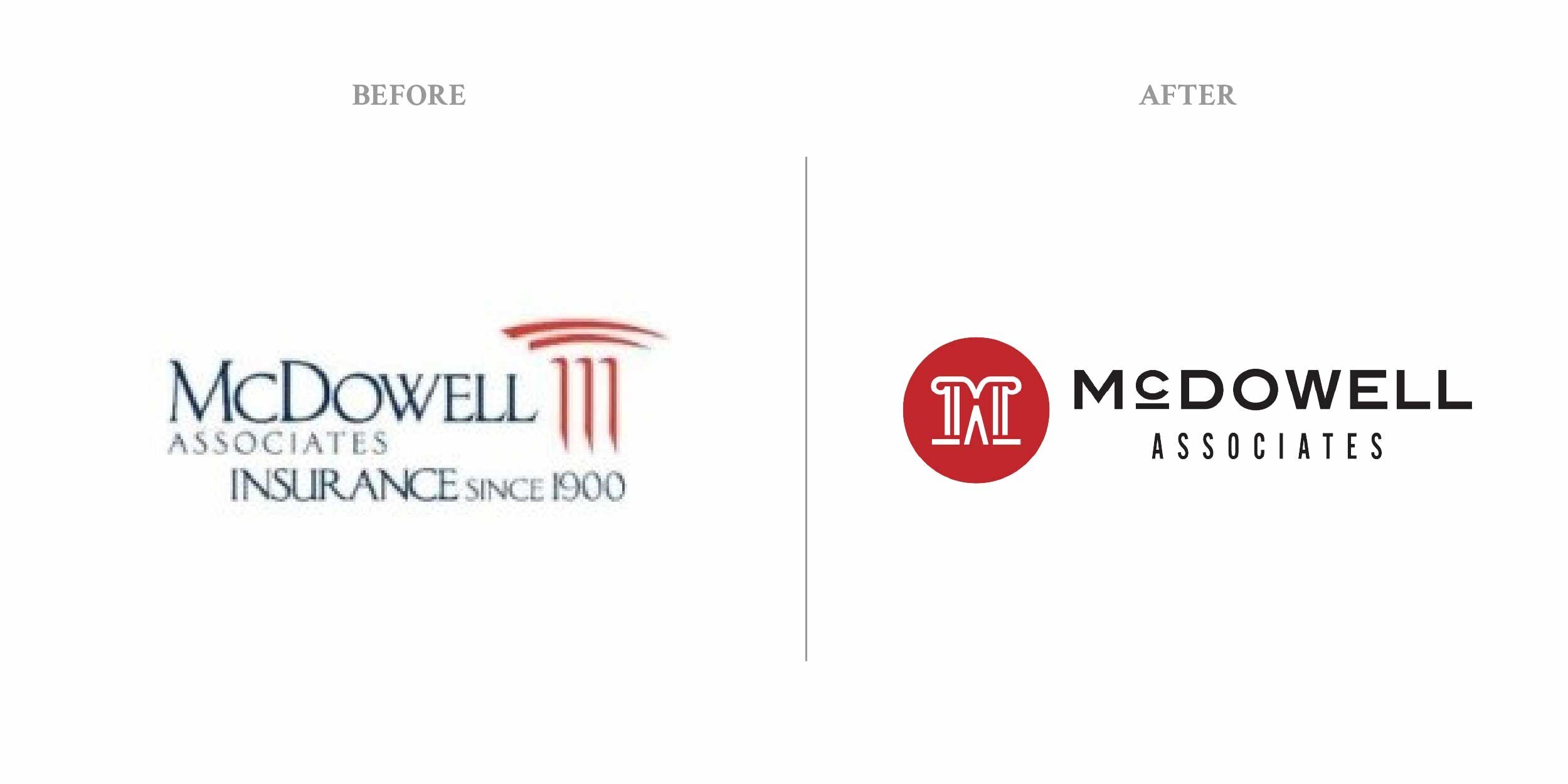
For a great example, check out our latest rebrand for our client McDowell.
Ready to see if your brand or logo could use a facelift? Reach out to us to learn more!